Understanding Texture in Interior Design
Texture is an often overlooked aspect in the design of a decorative scheme, yet it can convey mood and style and add interest and depth to an interior.
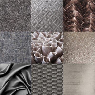
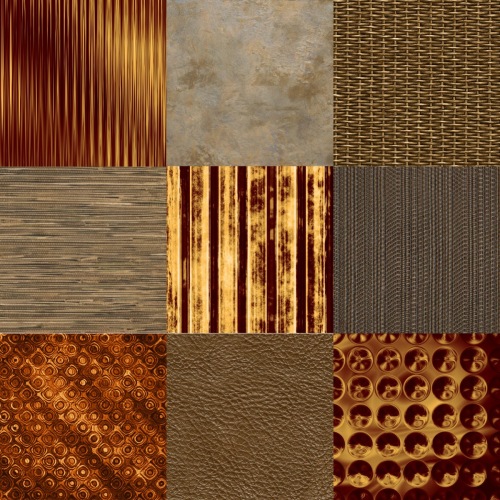
Texture is the surface quality of a material. It refers to the quality of a surface as perceived directly by touch (tactile texture) or indirectly by the eye (visual texture). Texture may be defined broadly to include the visual properties of solidity, reflectivity, translucency and transparency.
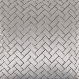
Tactile texture is produced by the physical surface texture (the relief) of a material – a surface can feel smooth, soft, hard, rough, ridged, grainy or bumpy to the touch. The play of light on the peaks and valleys of an innately textured surface creates highlights and shadows which enhance the visual texture.
Visual texture (sometimes called illusionary or simulated texture) can be produced by colour, or by pattern. A particular surface can be made to appear quite different to the way it feels to the touch: smooth surfaces can have visual textures, small pattern can be ‘read’ as texture, and a faux finish can imitate other materials such as wood, brick, marble, silk or stone.

Texture is the element that is most overlooked in design, but is essential in providing visual and tactile interest and it reinforces the other elements in conveying the mood and style of the design concept. Uniformity of texture will produce a bland and unsatisfactory design scheme, even when there is variation in the other elements such as colour, but a scheme based on a restrained palette of colours and materials can still provide interest through textural variety.
Careful composition of texture in an interior is as important as the composition of light and colour. The scale of textural patterns should be proportionate to the size of the space and of the surfaces within it, including the scale of furnishings, window treatments and object surfaces. Since texture can visually ‘fill’ spaces, it can be used to make large spaces feel smaller and more intimate, and should be used more sparingly in smaller spaces.
Textures should be handled in a unified manner, with every texture in an interior feeling compatible with every other, but some contrast and variation in texture is important for relief and for emphasis.
Harmony is key to good texture coordination – a harmonious textural scheme incorporates a balance of compatible textures that combine to produce a discernible mood or style.
Texture can be consciously manipulated by light to enhance the beauty or downplay the imperfections in surface materials. Texture can be emphasized or minimised by careful attention to the quality and angle of light – strong light directed from an angle dramatizes the natural relief (highlights and shadows) of a surface; while diffuse light minimizes texture and tempers the appearance of roughness, ridges or bumps.
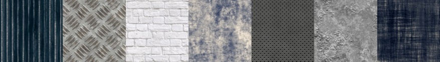
Texture influences how light is reflected from a surface and thus the appearance of colour. Smooth, polished surfaces reflect light well, attract the attention, and make colours appear lighter and more intense; rough and matt surfaces absorb light unevenly so their colours appear darker. Contrasting textures are more prominent – that is to say, subtle textures appear finer next to coarse textures and coarse textures appear more dramatic next to fine ones.
Smooth textures reflect more light so they look and feel cooler and lend a more formal, modern or refined look. Raised textures (coarse or soft) absorb more light, so they convey a sense of warmth. They also add visual weight to an object and can create a more casual, rustic or industrial effect.
In the same way as horizontal, vertical or oblique lines direct the gaze, textures with a directional pattern or grain can be used to make surfaces appear wider or taller. Coarse textures can also make objects appear closer, reducing their apparent scale and increasing their apparent ‘weight’. Finer textural patterns, when viewed from a distance, appear smooth, and distance appears to smooth even coarser textural patterns to a degree.
Texture also has other sensory impacts so textures should be appropriate to their intended use – soft upholstery fabrics are pleasant to touch, coarse ones can be uncomfortable and sleek ones can feel slippery and cold. Texture also affects the acoustics of a space – uneven and porous textures absorb sound, while smooth surfaces reverberate and magnify it.
Upkeep is also a consideration in textural selections. Smooth, flat surfaces show dust and fingerprints, but are easier to clean and maintain, while uneven surfaces, such as deep carpet pile, conceal dirt but are harder to clean. Smooth surfaces with visual textures combine the best features of both – they conceal dirt and are easy to clean.

Hey, Thanks for the guide.
LikeLike
Very nice article. Really helpful.
LikeLike
Textures are mostly overlooked in interior design. I think we need to pay more attention to them becouse they give overall look to our space. Make it better or worse.
LikeLike