


Colour in Interior Design: Part 1
Using Colour
CONTENTS
- The Importance of Colour
- The Colour Wheel
- The Dimensions of Colour
- Hue
- Value
- Intensity
- Progression and Contrast
- Colour Temperature and Mood
- The Effect of Colour on Space
- Colour Response
- Considerations in Colour Selection
1. The Importance of Colour
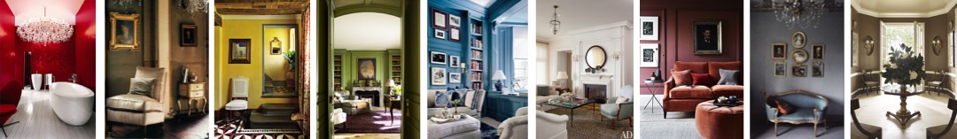
Colour is one of the most fundamental and influential aspects of interior design. Colour selection is a major factor in determining the success or failure of a decorative scheme. The carefully considered use of colour can unify furnishings and finishes to produce a cohesive and pleasing result. Colour plays a major role in defining the mood of a scheme and so the designer should allow the visual design concept (derived from the brief), together with consideration of the shape and proportions of a room, to guide and inform the selection of colours in order to achieve the desired effect.

2. The Colour Wheel

The colour wheel is a helpful tool to examine the relationship between colours. It represents the linear spectrum of visible light (the colours of the rainbow, from red to violet) and joins the ends of the line to form a circle. The colour wheel enables to visualize and define colour combinations that work well together (colour harmonies).
The first colour wheel is attributed to Sir Isaac Newton in the early 18th century (who also discovered the visible spectrum of light in the mid-17th century). Newton arranged the primary and secondary colours (more about those in Part 2) on a rotating disc and found that, as the disk spins rapidly, the colours blur together so that the eye sees white.
The colour wheel provides a system for relating colours to one another in order to devise the basis of a colour scheme. If the designer derives a colour scheme from some other source of inspiration, the colour wheel is still useful to identify the type of colour combination selected and to rationalise how (and to provide a guide as to whether) the scheme works.
The basic types of colour scheme are designated according to the position of the component colours on the colour wheel. Following a specified type will usually result in a pleasing scheme, although the designer should be guided, not bound, by it. Variations are desirable; an otherwise restrained monochromatic or neutral scheme can be enlivened and transformed by introducing small amounts of contrasting colour (accent colours). Achieving a satisfying balance is a question of judgment: the ‘rules’ of colour are to be treated as guidelines; not diktats.
Read more about the Colour Wheel and the basics of Colour Theory in Part 2.
3. The Dimensions of Colour
To describe colours with any degree of precision, it is necessary to distinguish the three attributes or dimensions of colour: hue, the name of the colour; value, the lightness or darkness of the colour, and intensity or chroma, its degree of strength or purity.
Hue
Hue is the most obvious characteristic of colour. Hue is described by the name of the colour (e.g. red, blue, yellow, etc.) and is determined by its position along the band of the visible spectrum. There are an infinite number of hues along the visible spectrum. A hue is a pure colour without tint or shade (see below). Hues are depicted on the colour wheel and the terms ‘hue’ and ‘colour’ are used interchangeably.
Value

Value is defined as the relative lightness or darkness of a colour and is determined by the amount of black or white which is either inherent in or added to the pure hue (of normal value). Value gradations are determined by the amount of light the colours reflect and values are changed by adding white or black to make colours reflect more or less light. Lighter values are called tints and darker values are called shades. There can be a light blue or a dark blue of exactly the same hue.
Apparent changes can also be made by altering the amount of light reaching the colour surface, or by placing the colour against backgrounds of contrasting colour values (degrees of light or dark). Value contrasts accentuate differences (simultaneous contrast), in the same way as colours affect one another. Like colour, value levels affect the character of a space and can change the apparent size of a room. An interior scheme composed of mainly bright values seems bright and spacious, while a room consisting of mainly dark values can create a sense of security and cosiness.
Combinations of hues are most natural when normal value relationships are maintained, particularly when used in large areas. That is to say, muted burgundy and olive green shades can provide a beautiful contrast to one another, but would not sit so well in a scheme with unmodified hues (such as primary red, blue and green) or very light tints (e.g. pastel pink and lilac). Colour values work best together within their own relative order of tint or shade.
It is generally found best to vary colour values vertically through a space. There is no stipulation that floors should be dark, or that ceilings should be light, but the relative placement of tones is generally more agreeable when the gradation from dark below to lighter above is observed. Floor surfaces usually seem best when darker in value, and therefore having a greater visual weight, than walls and ceilings; ceilings are usually lighter than floors and walls; walls, furnishings and window treatments are usually of intermediate values. Exceptions can be skilfully executed, but should be approached cautiously.

Tints
A tint is a lighter colour tone than the normal value of the pure hues in the colour wheel, produced by mixing a pure chromatic colour (of normal value) with white, light grey or another hue lighter than the original. The colour wheel (left) shows hues of normal value with 50% white added to make tints of those hues.
Unless handled skilfully, a room composed of light tints can seem cold and clinical. Contrasts of light and dark can add interest to a room, and middle values provide a transition to avoid harshness.

Shades
A shade is a darker colour tone than the normal value of the pure hues in the colour wheel, produced by mixing a pure chromatic colour (of normal value) with black, dark grey or another hue darker than the original. The colour wheel (left) shows hues of normal value with 50% black added to make shades of those hues.
Unless handled with skill, a room composed of mainly dark hues can seem gloomy and claustrophobic. As with tints, value contrasts and skilful use of value transitions can uplift a dark scheme.
Intensity
The terms intensity, saturation and chroma refer to the relative purity, vividness or saturation of a colour, as contrasted with greyness, dullness or neutrality of that hue. A colour is at full intensity at the normal value of the hue, which are described as being of high or strong intensity. An intense colour can be dulled or desaturated by addition of a colour which is remote from it in the spectrum, making it less pure or intense.
To actually increase the intensity of a hue, more of the dominant hue (at the normal value) is added. To apparently increase the intensity of a hue, the object can be illuminated with bright light of the same hue, or thrown into contrast with its complimentary hue (or a greyed tone of the same hue, or a neutral colour).
Large areas of intense colour can be overwhelming. The actual intensity of a hue is decreased by adding grey or its complementary hue (located opposite on the colour wheel). The apparent intensity of a hue is decreased by illuminating it with less bright light, or more diffuse light, or light of a complementary hue; or by placing it adjacent to either a more intense hue or an analogous hue.
Tones
Tone often used to denote intensity. A tone is a general term for a neutralised, greyed or toned-down hue. A tone is created by adding both white and black, which is grey. Tones can be darker or lighter than the original hue. They are considered more complex and subtle than tints and shades. Brilliant colour are sometimes described as ‘jewel tones’, while greyed colours are described as ‘muted tones’.
Neutrals
Neutral colours are popular for decorative schemes. True neutrals are black, white and greys (termed achromatic, meaning without colour), but the interior design lexicon has an expanded the meaning to include desaturated and less bright colours, particularly natural, earthy colours (even though they are actually neutralized coloured hues rather than pure neutrals). A colour becomes neutralised by adding grey or brown.
4. Progression and Contrast
Contrast, or opposition, is the arrangement of opposites of an element to create visual interest and drama. Colour contrast is the difference between one or more colours or colour values or intensities. Large variances or abrupt changes are described as ‘sharp’, ‘high’ or ‘vivid’ contrast; small variations are described as ‘low’ contrast.
Contrast in colour may involve using complementary colours which sit opposite one another on the colour wheel; or may involve value contrast – the placement of high-key colours (light values) adjacent to low-key colours (darker values), with no progression through the middle values between them.
Contrast adds interest and drama, offers relief from uniformity, emphasises the shapes of furnishings and can provide balance to a scheme. Contrast also makes a scheme more dynamic. Restraint in the variety of colour should be counter-poised by diversity and contrast in colour values or intensities, and in other elements such as texture, in order to provide interest.
Value contrasts are important to enable the observer to distinguish form, judge depth and discern changes in plane. Under minimal lighting, when differences in hues and intensity are less easy to distinguish, value contrasts are the most perceptible aspect of colour. This is because the cones in the eye are not able to function in dim lighting, but the rods in the eye can operate to distinguish light from dark. Thus value is the most critical aspect of colour for perception, particularly in minimal lighting conditions.
Among sharp contrasts of light and dark, a few middle values are usually needed to provide a transition and avoid severity. Within a monochromatic colour scheme (using various values of a single colour), or a neutral scheme (using black, white, grey, brown, beige or off-whites), value gradations become very important.
5. Colour Temperature and Mood
 Each hue has its own visual ‘temperature’. So-called ‘warm’ colours can make us actually feel physically warmer and cool colours can make us feel colour. Warm light (red, yellow and orange) intensifies warm colours and neutralizes cool colours (blue and violet); cool, bluish light has the opposite effect.
Research shows that warm-coloured interiors feel comfortable to occupants at lower actual air temperatures than required to achieve the same level of comfort in a cool-coloured but otherwise identical space, and so are often preferred in colder climates. Cool colours tend to lower the perception of actual air temperature and so can improve comfort in hot climates (or in artificially hot settings).
A colour can be made to seem either warmer or cooler in one of two ways (Nissen et al, 95). First, by mixing it with a colour of the desired temperature. For example, green can be made to appear warmer by adding a warm colour such as yellow; or cooler by mixing it with another cool colour such as blue.
The second method involves colour placement. It is possible to increasing the visual temperature of a hue by placing it with adjacent or surrounding hues of the opposite temperature; or to reduce its visual temperature by placing it with adjacent or surrounding hues of a similar temperature. For example, green can be made to seem warmer placing it next to, or surrounding it by, another cool colour such as blue . Green can be made to appear cooler by placing it adjacent to, or surrounding it by, a warm colour such as yellow.
A decision whether to work towards a colour scheme characterised as warm, cool or neutral can be influenced by a number of factors:
- Climate – Cool colours are generally preferred in warmer climates or holiday homes where summer occupancy is most usual, and warmer colours may be considered more acceptable in colder climes.
- Activity – Warmer colours are preferred in stimulating environments and cooler colours in calm, contemplative settings. The stimulatory and relaxing effects of warm and cool colours, respective, are proportional to the intensity of the colours used, so there is a wide range of possibilities through the gradation of colour tones.
- Orientation – South-facing windows which admit a lot of daylight all year round suggest a cool or neutral scheme, while a northern orientation suggests the use of warmer colour combinations.
- Preference – Spaces designed for a particular occupant can take individual colour preferences into account, while spaces designed for many end-users might best avoid overuse of intense colours.
These guidelines may conflict in reality: a north-facing room in a Mediterranean home leads to conflicting suggestions of warm and cool tones, and a fondness for deep red may conflict with a desire for a calm and relaxing ambience. Where conflict arises, it becomes a matter of judgment which indications should be given priority, or whether neutral or complementary colours would best balance competing considerations.
6. The Effect of Colour on Space
The apparent size and shape of a space can be modified to an extent by colour selections. The choice between warm and cool colours, or between light and dark tones, can magnify or minimise the apparent dimensions of a room. Colour can affect the apparent size of a space, the visual height of a ceiling or the seeming width of a corridor, so designers can make practical use of the visual effects of different colours to modify spatial perceptions.
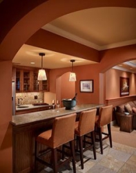
Warm hues such as reds, oranges and yellows (and all their combinations) are known as advancing hues because they seem closer to the observer than they actually are, which leads to two apparently contradictory visual effects, depending on the size of the area of colour usage and the intensity of the hue. A small, segregated colour area, such as a piece of furniture upholstered in warm, intense colours will appear closer to the observer, and therefore larger than it actually is. A large, surrounding colour area, such as intensely warm-coloured walls also appear closer but, conversely, make the room seem less spacious than it really is. In the same way, intense colours and dark tones will appear closer than neutrals or light tones of a similar hue.
Cool colours are known as receding hues because they have the opposite visual effects. Blues, greens and violets (and all combinations of these) appear to be further away than they actually are. Receding hues reduce the apparent size of small, segregated colour areas (such as objects) but appear to increase the dimensions of a room when used on large, surrounding colour areas (such as walls). Similarly, neutrals and light tones of a colour appear further away than intense colours or dark tones of a similar colour.
The calculated use of warm and cool colours, and of light and dark tones, can achieve a number of practical effects. Small spaces can be made to feel more spacious by using cool, receding colours with low contrast between them; while large spaces can be made to feel less expansive by using warm, advancing colours and strong colour contrasts. Advancing colours can be used on a high ceiling (and on the uppermost section the wall) to make it appear lower; receding colours can be used to make ceilings appear higher. Long, narrow spaces can be made to feel less like a corridor by using advancing colours on the short walls.
7. Colour Response
Research shows that colours can affect the way we feel. Some psychological reactions to colour are learned associations, shaped by our culture (and cultural symbolism) as well as by personal experience (Dodsworth 146); other emotional impacts and interpretations of colour may be inborn, intuitive and universal to everyone, such as the physical stimulus of intense red or the lack of stimulus provided by white, black and grey (Pile. 151).
Colours and colour temperature affect the mood of an interior, and can have a psychological impact on observers. Colour can cheer, stimulate or relax us. Colours on the warm side of the colour circle feel welcoming, comfortable and stimulating. Colours on the cool side of the colour circle seem calming and relaxing. Extremely cool colours can have a depressive psychological impact. Neutral colours, which fall between warm and cool, have a less intense psychological impact and can suggest a business-like, utilitarian atmosphere with a minimum of emotional content (Pile, 137) and are considered pleasant and unobtrusive background colours. Extremely neutral colours can appear bland and boring.

There are also certain psychological associations related to specific colours. Red is associated with fire and blood and therefore connotes heat, force, intensity and danger. Red can raise body temperature, pulse rate and blood pressure. When red is reduced to a tint, it becomes pink and loses some of its psychological intensity; lighter pinks in particular are associated with femininity and delicacy. When reduced to a shade, red becomes brown.
Red mixed with yellow produces orange, which retains some of the intensity of excitement implied by red. Orange tends to produce a cheerful response which is why it is widely used in commercial settings. Orange tints include beige and tan, which are popular background colours; orange shades include browns.

Among the warm colours, yellow has the least intense impact. It is considered less aggressive than red. Yellow is the colour of sunshine, happiness, activity and mild stimulation. Yellow tints include creams, beiges and light tans, considered pleasant background colours. Its shades include tans and browns.
Browns are more alike than the reds, oranges and yellows from which they derive. Browns are warm, dignified and comforting; they can be rustic or refined. As well as positive connotations of wood, raw textiles, brick and earth, they also have unfortunate associations with dirt and soil. Without the lift of livelier colour accents, browns can seem oppressive and drab. Despite its popularity in interior schemes, public opinion surveys reveal that brown is the least favourite colour of Europeans and Americans.


Green is the warmest of the cool colours thanks to its yellow content. Its association with grass and trees, makes green calming and restful to the eyes. Green is regarded as the most natural colour with connotations of health and wellbeing. Tints of green share these characteristics in reduced intensity; shades of green signify dignity and solidity.
Blue is the coolest of the cool colours and appears restful and calm. Its associations with sky and water suggest spaciousness, simplicity and purity. Blue has the opposite physical effects to red; it can lower body temperature, pulse rate and blood pressure. Blue is thought to encourage contemplation. Tints of blue share these characteristics, to a lesser degree. Shades of blue become increasingly dignified (and potentially depressive) as they move towards black.


Violet and purple should be approached with caution as they incorporate the conflicting values of warmth and coolness, of dynamism and calm, and can be quite disturbing to some observers. Pale tins of violet are thought of as playful and feminine. Deeper shades of purple can be dignified, mystical and even threatening.
White is not strictly a colour, but is the result of the combination of all colours. Its absence of chromaticity makes it a symbol of purity, simplicity, clarity and cleanliness. The colour name white is used for a variety of near-whites which are actually slight tints of more chromatic colours – warm or cool whites are popular background colours. White is a favourite of of modernist design (particularly in combination with black and primary colours) and has become a symbol of modernism.


Black is another non-colour; the opposite of white. Black is a strong colour with implications of strength, dignity and formality, with implications of emptiness or gloominess. Black has negative associations with fear and death. The contrast of black with white (both non-chromatic colours) can be striking. Pure black can be warmed or cooled by the addition of chromatic colours.
Grey results either from the mixture of black and white, or from mixtures of complementary colours. Greys are neutrals that can range from light to dark and from non-chromatic (totally neutral) tones to warmer or cooler chromatic tones, depending on the temperature of the tones tones they are mixed with. Light greys do not have strong associations and are useful background tones for more chromatic colours. Darker greys share the characteristics of black, albeit to a lesser extent, and can be authoritative or ominous.

Colour conditioning, commonly used in retail and commercial interior design, involves the use of colour to promote efficiency, cognitive performance or consumption. For example, many fast-food outlets use reds and oranges, which are thought to encourage diners to eat quickly and leave, while luxury brands use softer colours to encourage browsers to linger.
Cultural and demographic factors influence the choice of colour scheme for retail or commercial interiors, depending on the target customers or users. While white signifies marriage in many Western countries, it is associated with death in China. According to research by psychologist E.R. Jaensch, people from sunny climes respond better to warm, bright colours; those from less sunny climates tend to prefer cooler, less saturated colours (which might seem counter-intuitive!). Where colours have different associations in different cultures, international retailers are likely to produce a customised strategy with respect to the colour associated with their brand – McDonalds use different websites with different colours across different countries. Purple is associated with luxury brands in Japan and value brands in the United States, while black is almost universally associated with expensive. In many parts of the world, consumers exhibit certain similarities in colour likes, dislikes, and associations – green, blue and white are well liked across countries and share similar meanings – which make standardised colour branding strategies more viable.
Children respond best to primary colours; young people tend to prefer bold, energetic colours; and older people more subtle colours and combinations, so retail designers take care to regulate colour intensity to match the taste of the targeted age group. Men tend to prefer bright colours and women are likely to respond better to softer colours. In a retail environment, understanding the cultural and demographic range of responses is important in enticing customers inside and encouraging them to purchase. Colour association extends beyond retail and commercial settings – prisons, hospitals and schools also use calming colours to influence the behaviour of inmates, patients and students.
8. Considerations in Colour Selection
Certain functions and traditions recommend certain colour selections as more appropriate than others. These recommendations are just that: they are not rules that prescribe one specific colour scheme for a given function or activity, but suggestions or guidelines which can be considered and rejected at will. As has been shown, for example, the relative placement of tones is most agreeable when the gradation from darker below to lighter above is observed. Even within a very limited range of colour tones, floor surfaces will normally be among the darkest tones in a space and ceilings will normally be among the lightest.
Also, we have seen that the decision whether to embrace a warm, cool or neutral colour palette may usefully be informed by considerations of climate, function, orientation and end-user preference. In the event of conflicting indications, it is a matter of judgment which considerations should take precedence, or whether a balanced middle way involving neutral or complementary tones might represent the better approach.
It is worth adding a few words about how the proposed function or activity of an interior will affect colour planning. Intense colour schemes are not always appropriate for multi-user spaces or rooms which are occupied for extended periods of time. Living rooms and dining rooms are thought to be most successful in mildly warm to neutral tones, with stronger tones reserved for smaller areas, such as furniture, window treatments, and accessories. Colours thought not to be conducive to the appetite include black and dark greys, strong blues and violets, and yellow-greens; while red is said to be the most stimulating. It may be wise to avoid intense colour on a bedroom ceiling or large wall areas (even in children’s bedrooms), since these are less conducive to relaxation and sleep. Strong colours in bathrooms reflect onto skin colour which can be unflattering to the occupants. Since warm colours are found to stimulate activity and cool colours to promote concentration and contemplation, either colour temperature would suit a study, library or home office.
Ambience is a major consideration in colour selection for residential interiors. There is a general preference for warm colour schemes (and warm accents within neutral or cool schemes) where a cosy and welcoming ambience is sought. Extremely warm or cool colours may be ideal for a particular room or space, but monotonous throughout a whole house or apartment. Open-plan abodes, as well as inter-connected rooms, require careful consideration of whether to treat the space as one, or how to relate different colour schemes in different zones, either through contrast or through unifying tones.
Slavishly following colour trends, particularly when vivid colour combinations are á la mode, is rarely an economical or advisable endeavour. In situations where a nod to colour trends is desirable, it is best reserved to cheaper and more easily replaceable elements in a room, such as lampshades, cushions or accessories. Structural and other major elements in a room are better served by classic and enduring colour tones and combinations.
Finally, when selecting colour, it should be borne in mind that texture and the nature of surfaces can affect colour perception. The same colour can appear different when the surface is smooth but not reflective (a matte or flat finish), compared to a gloss finish. A surface which is polished or coated to produce surface reflection is described as glossy (Pile, p.30). Gloss modifies colour by interposing a layer of ‘veiling reflection’ over the actual colour, making it appear lighter and less intense. In general, the rougher the texture, the darker its colour will appear. As a practical matter, sample colours can only be judged with any accuracy if the sample has the same texture and gloss as the finished surface; using a paper sample to select a carpet, for example, may give an inexact and unexpected result.
Read Part 2: Colour Harmony (coming soon)
Sources
Dodsworth, Simon (2016) The Fundamentals of Interior Design, 2nd edition
Nielsen & Taylor (1994) Interiors: an introduction, 2nd edition
Nissen, Faulkner and Faulkner (1994) Inside Today’s Home, 6th edition
Pile, John (1997) Colour in Interior Design
Studholme, Joa & Charlotte Cosby (2016) How to Decorate

Very good explanation about the color theory and would it be nice of you can have some readings about how to know the percentage of mixing a color the monochromatic colors like red with tints
LikeLike